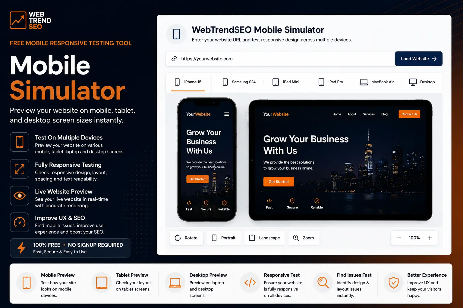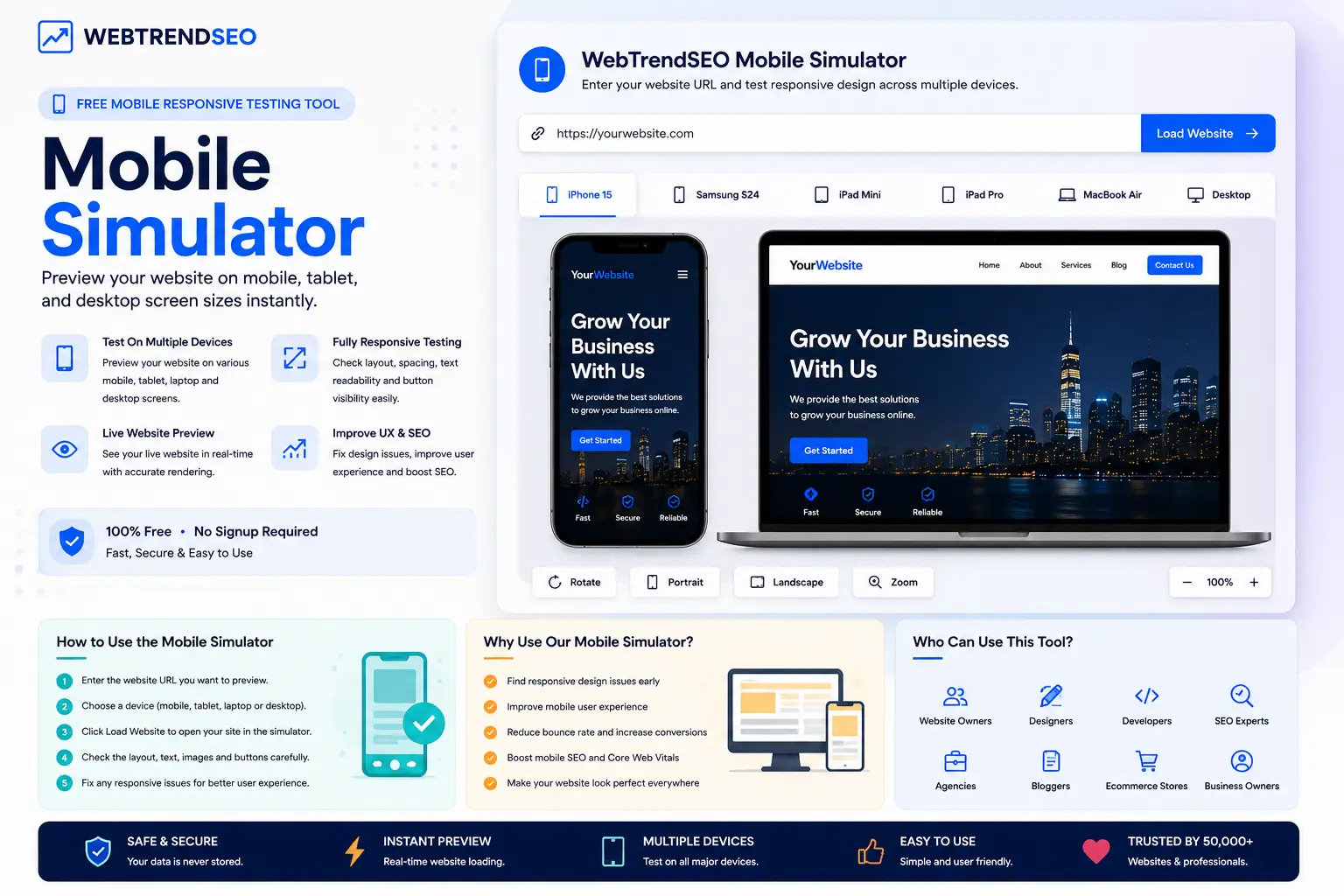
Preview your website on mobile, tablet, and desktop screen sizes instantly.
Preview any website on mobile, tablet, and desktop devices in a clean one-screen simulator.
Mobile Simulator
Devices
Custom Size
Enter your website URL and test responsive design across multiple devices — no signup required.
WebTrendSEO’s Mobile Simulator helps you check how your website appears on different screen sizes before users visit it. You can preview mobile, tablet, laptop, and desktop views to find layout issues, broken sections, spacing problems, and responsive design errors.
Use this free tool to test your website design, improve mobile user experience, and make sure your pages look clean across every device.

Mobile Preview

Tablet Preview

Desktop Preview

Responsive Design Test

Device Size Options

Live Website Preview

Layout Issue Check

UX Testing

Free to Use
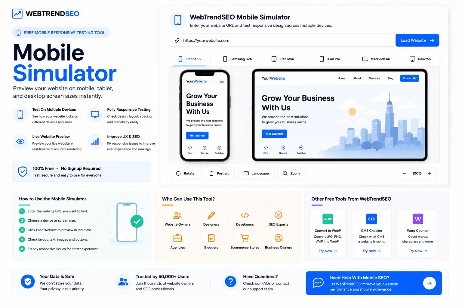
Testing your website on different devices is simple and fast.


Most users browse websites from mobile devices. If your website does not fit properly on smaller screens, visitors may leave quickly and your conversions can drop.
Our Mobile Simulator helps you preview your website on 100+ different device sizes so you can find responsive design issues, layout shifts, unreadable text, broken buttons, and spacing problems before they affect real users.

Custom Size Option

Preview multiple screen sizes

Useful for SEO and conversions

100% free to use

100+ Devices

No signup required

Before you publish a new page or update your design, test your website across mobile, tablet, and desktop screens to make sure everything looks perfect.
This Mobile Simulator is useful for website owners, designers, developers, SEO experts, agencies, bloggers, and businesses that want a better mobile experience.


Your website preview is processed securely and is not stored permanently. Your privacy and data security are our priority.
Explore answers to common questions about mobile responsiveness, website preview testing, screen sizes, responsive design, mobile SEO, and how WebTrendSEO helps improve website usability.
A Mobile Simulator is a tool that lets you preview how your website looks on different screen sizes, including mobile phones, tablets, laptops, and desktops.
Yes. WebTrendSEO’s Mobile Simulator is free to use and does not require signup. You can enter your website URL and preview your design across multiple device sizes.
Yes. A mobile-friendly website improves user experience and can support better SEO performance. This tool helps you find responsive design issues that may affect mobile visitors.
You can check mobile layout, tablet layout, desktop layout, text readability, image fitting, button visibility, spacing issues, design breaks, and overall responsive performance.
Website owners, SEO experts, designers, developers, agencies, bloggers, ecommerce stores, and business owners can use this tool to check how their website looks on different devices.
You should test your website after every design update, theme change, plugin change, new page launch, or major content update to make sure the layout still works properly.
Use our free tools to test your website, or let WebTrendSEO create a complete mobile SEO, technical SEO, and user experience strategy for your business.
Fell free get in touch with us via phone or send us a message
phone: +92 3400 644414
email: contact@webtrendseo.com